
What Five Product Landing Pages Teach Dropshippers
Four live product pages and a supplied Jovgelo screenshot reveal practical lessons for dropshippers on offers, proof, trust, and checkout clarity.
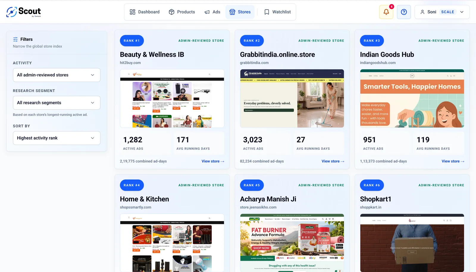
An ad can bring someone to a product page, but the page still has to answer a practical question: *what am I buying, why should I trust it, and what happens after I order?* We reviewed product landing pages from stores selected for Scout research to see how different sellers handle that moment.
The supplied store snapshot listed ShopVise (134 active ads), Jovgelo (131), Prime Kart (325), Olivify (181), and The Daily Drops (664) at that point in time. These are supplied ad-activity counts, not verified orders, revenue, or profitable campaigns. We did not independently refresh those counts for this article.
On 26 September 2026, four product pages were reachable and captured on desktop. The supplied screenshot shows a Jovgelo garment-steamer page, but jovgelo.com did not resolve during our separate live check. We therefore treat that screenshot as supplied evidence, not as a verified live page. Screenshots document what was visible when captured; prices, offers, and page design can change.
ShopVise: lead with the use case and the offer
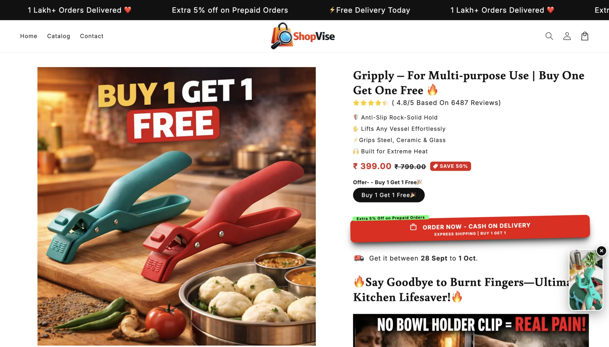
The Gripply product page puts a large kitchen-context product image beside short benefit bullets, a visible price, a buy-one-get-one offer, and a cash-on-delivery order action. Further down, it explains the kitchen problem and shows more product visuals.
The useful pattern is fast relevance: a visitor can see the tool, its kitchen context, and the bundle before reading a long description. In the supplied mobile recording from 22 September, the cash-on-delivery action remains visible while scrolling through comparisons and feature explanations. A seller testing a similar approach should show the product performing its real task and state the exact quantity delivered. Treat ratings, customer totals, discount percentages, and delivery promises as claims that need your own evidence; their presence on another page is not proof they are true or effective.
Prime Kart: keep one product promise coherent
On Prime Kart's Bondit sealant page, the packaging image, headline, benefit chips, price, and order button all point to the same repair use case. The longer page adds surface examples, application steps, and before-and-after framing. It gives a customer a path from “Will this work for my repair?” to “How would I use it?”
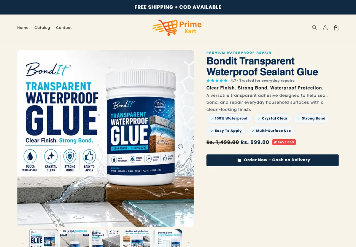
For a product with compatibility limits, this structure can reduce avoidable uncertainty. Name the surfaces and situations the item is intended for, but also state what has not been tested. A strong visual promise should never outrun the actual product instructions or evidence.
Olivify: make size and use cases visible, but watch the density
Olivify's portable storage bag page uses its first image as a compact specification sheet: capacity, dimensions, features, and example uses appear beside the bag. The purchase panel adds a bundle offer, price, payment incentive, testimonials, and an order timeline.
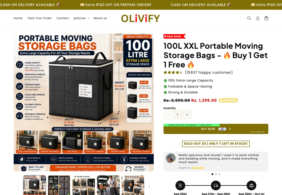
The lesson is to answer the biggest product objection visually. For a storage bag, size is not an afterthought: buyers need to imagine what will fit. The trade-off is information density. Before copying this approach, test whether a mobile visitor can still identify the item, quantity, final price, and primary button at a glance. Scarcity counters and testimonial numbers should be used only when they are genuine and supportable.
The Daily Drops: explain the pack and the task
The Daily Drops' Cyclora page starts with the problem and product format, then shows two pack choices with packet counts and per-packet prices. Shipping, payment methods, instructions, and handling information appear on the page as well. This is a more educational route than a simple discount-first page.
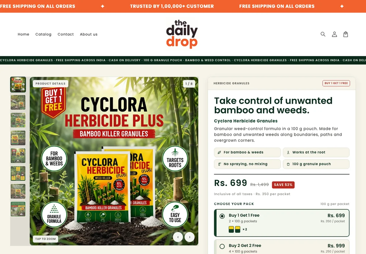
The transferable idea is offer arithmetic that the buyer can check. When a bundle says “buy one get one,” specify packet size, total packets, and effective unit price. The supplied mobile recording shows the page's purchase action staying available as the visitor reaches demonstrations and specifications. For products involving chemicals or other safety-sensitive use, clear handling guidance and substantiated claims matter more than a persuasive headline. We did not test this product's efficacy or safety.
Jovgelo: make the offer easy to compare—and the claims easy to check
The supplied screenshot of Jovgelo's garment-steamer page places the product illustration and use-case claims beside the price, plug variant, one-, two-, and three-unit offers, and add-to-cart button. Buyers can compare bundle prices without hunting for another section. For an electrical product, the visible US plug selection also raises an important India-market question: which plug and voltage will the buyer actually receive?
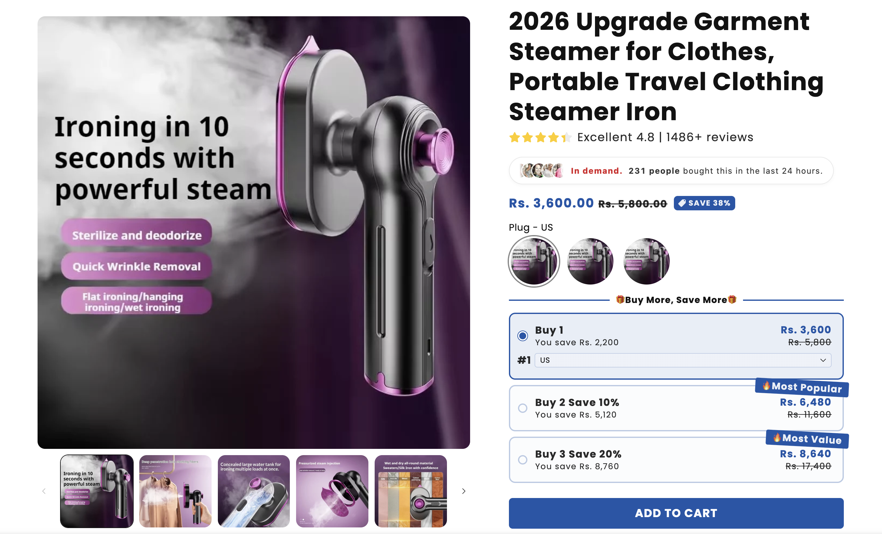
The page also displays a review count, a recent-purchase count, a discount, and a "10 seconds" performance claim. Those are the seller's claims; we did not verify them. The useful lesson is to pair clear bundle arithmetic with equally clear compatibility and substantiated proof. We could not load jovgelo.com during our live check. That says nothing about historical sales, but it shows why DNS, HTTPS, page availability, and checkout uptime belong in a seller's conversion checklist.
What the five pages have in common
The five observed pages take different creative routes, but each tries to answer at least three questions near the buying decision:
- Use case: What problem does the product address, and can I see it in context?
- Offer: What exactly arrives, at what price, and with which bundle or variant?
- Friction: How can I pay, when might it arrive, and what happens if it is unsuitable?
Borrow those questions, not another store's images, copy, reviews, or urgency claims. Start with your own product photos or a real demonstration. Keep the first screen focused. Put compatibility, sizing, ingredients, care, and returns where the buyer needs them rather than hiding them behind a generic FAQ.
How to tell whether your version actually works
Screenshots, recordings, and active ads cannot tell us which of these pages makes sales. To test your own landing page, keep the ad audience and offer stable while changing one meaningful element: the first image, headline, bundle explanation, or trust information. Measure product-page visits, add-to-cart rate, checkout starts, paid orders, delivered COD orders, refunds, RTO, and contribution margin—not just clicks or a busy ad library.
A useful page is not necessarily the loudest. It is the one that helps a real buyer understand the product, sets expectations you can fulfil, and survives a small controlled test after all costs are counted.